Improving Perceived Performance with Multiple Background Images
Written by Harry Roberts on CSS Wizardry.
Table of Contents
I’m on a train right now, which means the wifi is awful. A lot of sites are refusing to load at all, and those that do have lots of images missing, leaving big blank holes in their web pages. Most of the images, thankfully, aren’t critical to understanding the content I’m looking for, but their absence does remind me that I’m waiting for something else to arrive, and in many cases it is perceived performance that is more important than the actual performance itself. This gave me a little idea.
A while back, I was consulting on a very high profile and very highly trafficked campaign website for a client that I’m, unfortunately, not allowed to name. I was brought in mid way through development to help make things fast.
The site featured a very large masthead image that, even when optimised, took a
little while to load. I did a bunch of stuff in order to prefetch the image,
fire off its request earlier, etc., but one of the simplest techniques I
employed was to apply the image’s average colour as a background-color, so
that the user wasn’t looking at a huge white space whilst the image loaded. This
improved perceived performance dramatically, and was and incredibly low-effort
implementation:
- Open the image in Photoshop
- Filter » Blur » Average
- Use the Eyedropper to sample the block of colour that is left
-
Apply that colour as a
background-color:.masthead { background-image: url(/img/masthead.jpg); background-color: #3d332b; }
This is a technique that I also use on this site’s homepage, on my very own masthead: if the image is taking too long to load, show the user a solid colour. However, just now on the train, I visited my own site and saw this:

The image isn’t actually content-critical, so it doesn’t matter that it hasn’t loaded, but—whilst probably better looking than my face—it’s still pretty jarring: it’s just a big, flat, soulless lump of colour. How can we improve it?
CSS Gradients and Multiple Backgrounds
Very simply put, I wanted to make a rough approximation of the photograph in a
CSS gradient. I can’t stress the words rough approximation enough here: we’re
literally talking about a few blobs of similar average colours. I was then going
to apply this as a background-image on the image itself, only: oh no! This
image already is a background image. Not to worry, we’ve been able to define
multiple backgrounds on the same element since
IE9. We can define the actual image
and its gradient approximation in one go, in one declaration.
This means that, if the browser has the CSS,
- it can paint the CSS approximation;
- it can make the request for the actual image, which can make its way over the network in its own time.
Read more about multiple backgrounds on MDN.
Making the Approximation
To get my CSS-blob version of my masthead, I opened it up in Photoshop and divided it up into regions of colour. Because most of the objects in this image run top to bottom, I made vertical slices. Very conveniently for me, those regions all occurred at 25% intervals:
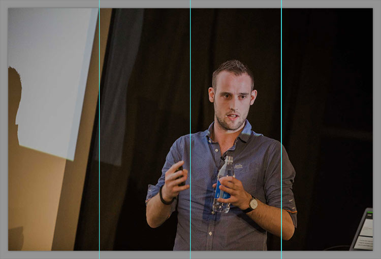
I then selected each section individually and ran Filter » Blur » Average, which left me with this:
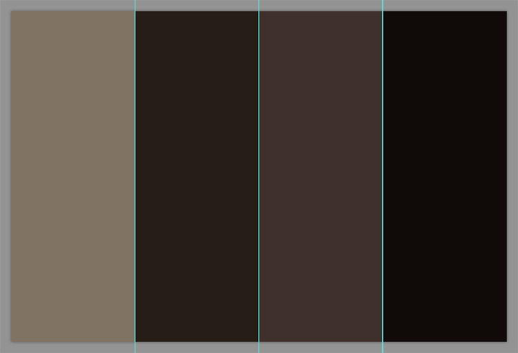
The next step was to sample each colour and plug them into a CSS gradient:
linear-gradient(to right, #807363 0%, #251d16 50%, #3f302b 75%, #100b09 100%)
That looks like this:
All I need to do now is apply this as a second value of my background-image
property:
.page-head--masthead {
  background-image: url(/img/css/masthead-large.jpg),
                    linear-gradient(to right, #807363 0%, #251d16 50%, #3f302b 75%, #100b09 100%);
}
The stacking order of multiple backgrounds is such that the first value (in this case, an actual image) is the topmost image, then the next sits underneath that, and so on.
This means that, if this image ever fails to load again, we see this:

Not a huge difference, but certainly less blunt than a completely flat image: it’s enough to add a little bit of texture and hint at the general composition of the missing images.
Practicality
There is, as you can see, quite a lot of manual work involved in implementing this technique. Unless/until there’s a way to reliably automate this, I think it’s a technique best used in use cases just like mine: a very specific image with a very low rate of change.
The next level down from this would be just taking the average colour of the
image and applying that as a background-color. There’s no need for gradients
and multiple backgrounds with that, but it does still require per-image
intervention.
However, I’m actually really happy with this as a way to provide something a little more substantial to users on poor network conditions. If your site has similar static images, I’d recommend experimenting with this technique yourself.
Update 2016-11-11
Since publishing this post, a couple of people have produced ways of (semi) automating this process.
Louis Bourque has a Color Extractor tool which will give you back the relevant gradient without having to fire up Photoshop.
Ben Briggs built
postcss-resemble-image which
will: Provide a gradient fallback for an image that loosely resembles the
original.
Pretty neat! Thanks, gentlemen.

Hi there, I’m Harry Roberts. I am an award-winning Consultant Web Performance Engineer, designer, developer, writer, and speaker from the UK. I write, Tweet, speak, and share code about measuring and improving site-speed. You should hire me.
You can now find me on Mastodon.
Projects

- ITCSS – coming soon…

Next Appearance
-
Talk & Workshop
 WebExpo: Prague (Czech Republic), May 2024