By Harry Roberts
Harry Roberts is an independent consultant web performance engineer. He helps companies of all shapes and sizes find and fix site speed issues.
Written by Harry Roberts on CSS Wizardry.
N.B. All code can now be licensed under the permissive MIT license. Read more about licensing CSS Wizardry code samples…
I have long held very strong opinions about the Critical CSS pattern. In theory, in a perfect world, with all things being equal, it’s demonstrably a Good Idea™. However, in practice, in the real world, it often falls short as a fragile and expensive technique to implement, which seldom provides the benefits that many developers expect.
Let’s look at why.
N.B. Critical CSS when defined as ‘the styles needed to render the initial viewport’.
Critical CSS is not as straightforward as we’d like, and there is a lot to consider before we get started with it. It is worth doing if:
…particularly when we talk about retrofitting it. Reliably extracting the relevant ‘critical’ styles is based, first and foremost, on some brittle assumptions: what viewport (or fold, remember that?) do we deem critical? How do we treat off-screen or un-interacted elements (think dropdown or flayout navs, etc.)? How do we automate it?
Honestly, in this scenario, my advice is almost always: don’t bother trying to retrofit Critical CSS—just hash-n-cache1 2 the living daylights out of your existing CSS bundles until you replatform and do it differently next time.
Implementing Critical CSS on a brand new project becomes markedly easier, especially with the correct3 CSS-in-JS solution that bundles and componentises CSS by default, but that still doesn’t guarantee it will be any faster.
Let’s look at the performance implications of getting Critical CSS right.
Critical CSS only helps if CSS is your biggest render-blocking bottleneck, and
quite often, it isn’t. In my opinion, there is often a large over-focus on CSS
as the most important render-blocking resource, and people often forget that any
synchronous work at all in the <head> is render blocking. Heck, the <head>
itself is completely synchronous. To that end, you need to think of it as
optimising your <head>, and not just optimising your CSS, which is only one
part of it.
Let’s look at a demo in which CSS is not the biggest render-blocking resource. We actually have a synchronous JS file that takes longer than the CSS does4:
<head>

  <link rel="stylesheet"
        href="/app.css"
        onload="performance.mark('css loaded')" />

  <script src="/app.js"></script>

  <script>performance.mark('head finished')</script>

</head>
When we view a waterfall of this simple page, we see that both the CSS and JS are synchronous, render-blocking files. The CSS arrives before the JS, but we don’t get our Start Render (the first of the two vertical green lines) until the JS has finished. The CSS still has a lot of headroom—it’s the JS that’s pushing out Start Render.
N.B. The following waterfalls have two vertical purple bars. Each of
these represents a performance.mark() that signifies the completed downloading
of the CSS or the end of the <head>. Pay attention to where they land, and if
they sit on top of either each other or anything else.

If we were to implement Critical CSS on this page by:
<head>

  <style id="critical-css">
    h1 { font-size: calc(72 * var(--slow-css-loaded)); }
  </style>

  <link rel="stylesheet"
        href="/non-critical.css"
        media="print"
        onload="performance.mark('css loaded'); this.media='all'" />

  <script src="/app.js"></script>

  <script>performance.mark('head finished')</script>

</head>
…we’d see absolutely no improvement! And why would we? Our CSS wasn’t holding back Start Render, so making it asynchronous will have zero impact. Start Render remains unchanged because we tackled the wrong problem.

In both cases—‘Blocking’ and ‘Critical CSS’ respectively—Start Render came in at exactly the same time. Critical CSS made no difference:
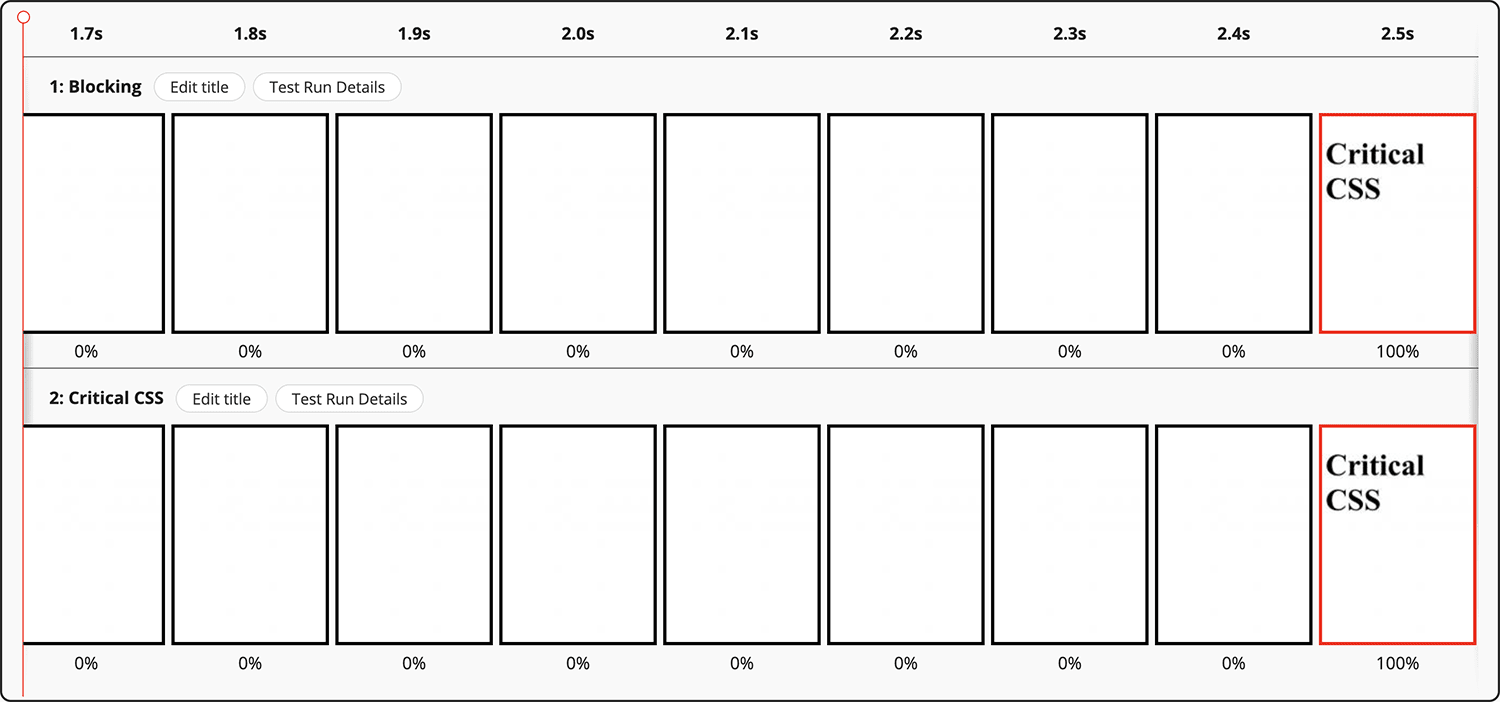
In a reduced test case like this, it’s blindingly obvious that Critical CSS is a wasted effort. We only have two files to focus on, and they’re both being artificially slowed down to force the output that helps prove my point. But the exact same principles carry through to real websites—your websites. With many different potentially-blocking resources in-flight at the same time, you need to be sure that it’s your CSS that’s actually the problem.
In our case, CSS was not the bottleneck.
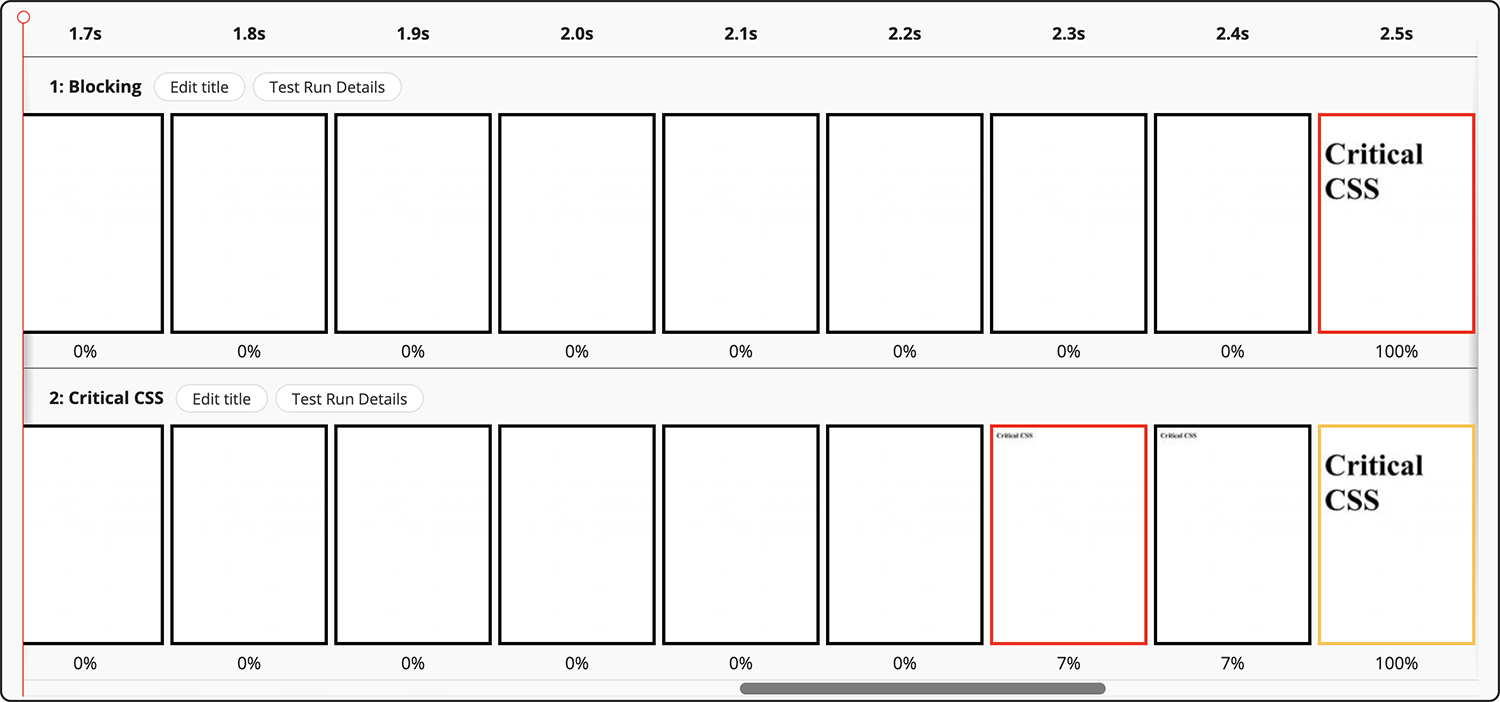
Let’s take a look at what would happen if the CSS was our biggest blocker:

css loaded and head
finished are synonymous.Above, we can clearly see that CSS is the asset type pushing out our Start Render. Does moving to Critical CSS—inlining the important stuff and loading the rest asynchronously—make a difference?

head finished and Start Render are identical;
css loaded is later. It worked!We can see now that Critical CSS has helped! But all it’s really served to do is highlight the next issue—the JS. That’s what we need to tackle next in order to keep making steps in the right direction.
font-size. More on this phenomenon later.Ensure CSS is actually the thing holding you back before you start optimising it.
This all seems quite obvious: don’t optimise CSS if it’s not a problem. But what presents a slightly more pernicious issue are the regressions that can happen after you successfully implement Critical CSS…
If you do identify that CSS is your biggest bottleneck, you need to keep it that
way. If the business approves the time and money for the engineering effort to
implement Critical CSS, you can’t then let them drop a synchronous, third-party
JS file into the <head> a few weeks later. It will completely moot all of the
Critical CSS work! It’s an all-or-nothing thing.
Honestly, I cannot stress this enough. One wrong decision can undo everything.
The next problem is with splitting the application of CSS into two parts.
When you use the media-switching pattern5 to fetch a CSS file
asynchronously, all you’re doing is making the network time asynchronous—the
runtime is still always a synchronous operation, and we need to be careful not
to inadvertently reintroduce that overhead back onto the Critical Path.
By switching from an asynchronous media type (i.e. media=print) to
a synchronous media type (e.g. media=all) based on when the file arrives, you
introduce a race condition: what if the file arrives sooner than we expected?
And gets turned back into a blocking stylesheet before Start Render?
Let’s take some very exaggerated but very simple math:
If it takes 1s to parse your <head> and 0.5s to asynchronously fetch
your non-Critical CSS, then the CSS will be turned back into a synchronous
file 0.5s before you were ready to go anyway.
We’ve fetched the file asynchronously but had zero impact on performance,
because anything synchronous in the <head> is render-blocking by
definition. We’ve achieved nothing. The fetch being asynchronous is completely
irrelevant because it happened during synchronous time anyway. We want to ensure
that the non-Critical styles are not applied during—or as part of—a blocking
phase.
How do we do that?
mediaOne option is to ditch the media-switcher altogether. Let’s think about it: if
our non-Critical styles are not needed for Start Render, they don’t need to be
render blocking—they didn’t ought to be in the <head> at all.
The answer is surprisingly simple: Rather than trying to race against our
<head> time, let’s move the non-Critical CSS out of the <head> entirely. If
we move CSS out of the <head>, it no longer blocks rendering of the entire
page; it only blocks rendering of subsequent content.
Why would we ever put non-Critical CSS in the <head> in the first place?!
printAs a brief aside…
Another problem we have is that CSS files requested with media=print get given
Lowest priority, which can lead to too-slow fetch times. You can read more
about that in a previous post.

By adopting the following method for non-Critical CSS, we also manage to circumvent this issue.
Rather than having a racy and nondeterministic method of loading our
non-Critical CSS, let’s regain some control. Let’s put our non-Critical CSS at
the </body>:
<head>

  <style id="critical-css">
    h1 { font-size: calc(72 * var(--slow-css-loaded)); }
  </style>

  <script src="/app.js"></script>

  <script>performance.mark('head finished')</script>

</head>
<body>

  ...


  <link rel="stylesheet"
        href="/non-critical.css"
        onload="performance.mark('css loaded')" />
</body>
What happens now?

Start Render is the fastest it’s ever been! 2.1s. We must have beaten the race condition. Nice!
There are a few things to be wary of with the </body> method.
Firstly, because the stylesheet is defined so late, it, naturally, gets requested quite late. For the most part, this is exactly what we want, but in the event that it’s too late, we could lean on Priority Hints to help out.
Secondly, because HTML is parsed line-by-line, the stylesheet will not be
applied to the page until the parser actually gets to it. This means that from
the point of applying the in-<head> Critical CSS to the non-Critical CSS at
the </body>, the page will be mostly unstyled. This means that if a user
scrolls, there is a strong possibility they might see a flash of unstyled
content (FOUC), and the chance of Layout Shifts increases significantly. This is
especially true if someone links directly to an in-page fragment identifier.
Further, even if the non-Critical CSS comes from HTTP cache very, very quickly,
it will only ever be applied as slowly as the HTML is parsed. In effect,
</body> CSS is applied around the DOMContentLoaded event. That’s kinda late.
This means that speeding up the file’s fetch is unlikely to help it be applied
to the document any sooner. This could lead to lots of dead, unstyled time, and
the issue only gets worse the larger the page. You can see this in the
screenshot above: Start Render is at 2.1s, but the non-Critical CSS is applied
at 2.9s. Your mileage will vary, but the best advice I have here is to make
very, very sure that your non-Critical styles do not change anything above the
fold.
Finally, you’re effectively rendering the page twice: once with Critical CSS, and a second time with Critical CSS plus non-Critical CSS (the CSSOM is cumulative, not additive). This means your runtime costs for Recalculate Style, Layout, and Paint will increase. Perhaps significantly.
It’s important to make sure that these trade-offs are worth it. Test everything.
If we’re battling through all of this—and it is a battle—how do we know if Critical CSS is actually working?
Honestly, the simplest way I’ve found to work out—locally, at least—if Critical CSS is working effectively is to do something that will visually break the page if Critical CSS works correctly (it sounds counter-intuitive, but it’s the simplest to achieve).
We want to make sure that asynchronous CSS isn’t applied at Start Render. It needs to be applied any time after Start Render, but before the user scrolls down enough to see a FOUC. To that end, add something like this to your non-Critical CSS file:
* {
  color: red !important;
}
The best techniques are always low-fidelity. And almost always use an
!important.
If your first paint is all red, we know the CSS was applied too soon. If the first paint is not red, and turns red later, we know the CSS was applied sometime after first paint, which is exactly what we want to see.
This is what the change in font-size that I mentioned earlier was
designed for. The reason I didn’t change color is because
Slowfil.es only provides one CSS declaration that I can
apply to the page. The principle is still the exact same.
There’s a lot to consider in this post, so to recap:
media=print hack is pretty flawed.<head> entirely.</body>.Many thanks to Ryan Townsend and Andy Davies for proofreading.
Zero-runtime, automatically deduped, and, ideally, placed in-<body> in <style> blocks—not in style attributes. ↩
I’m using Slowfil.es to force the slowness. ↩
media=print onload="this.media='all'" ↩
N.B. All code can now be licensed under the permissive MIT license. Read more about licensing CSS Wizardry code samples…
Harry Roberts is an independent consultant web performance engineer. He helps companies of all shapes and sizes find and fix site speed issues.

Hi there, I’m Harry Roberts. I am an award-winning Consultant Web Performance Engineer, designer, developer, writer, and speaker from the UK. I write, Tweet, speak, and share code about measuring and improving site-speed. You should hire me.
You can now find me on Mastodon.
 Devoxx Greece: Athens (Greece), April 2025
I help teams achieve class-leading web performance, providing consultancy, guidance, and hands-on expertise.
I specialise in tackling complex, large-scale projects where speed, scalability, and reliability are critical to success.