By Harry Roberts
Harry Roberts is an independent consultant web performance engineer. He helps companies of all shapes and sizes find and fix site speed issues.
Written by Harry Roberts on CSS Wizardry.
N.B. All code can now be licensed under the permissive MIT license. Read more about licensing CSS Wizardry code samples…
In my work, I come up against the task of theming UIs quite frequently. So much so, in fact, that last year I gave a full conference talk on the subject.
My usual advice to companies and clients who want to implement theming in their UIs is simply don’t.
There are very few specific cases where theming will provide business value, but for the most part, it is a lot more hassle than it’s worth. Theming
All whilst providing negligible value—are users/customers really less likely to use your product if they can’t theme it?
Exceptions are usually white-label solutions in which a customer purchases a license for your software, and then wish to run it as though it was their own platform. Most other cases are not business critical, so do yourself—and your team—a favour and avoid it if at all possible.
However, with that said, by using some newer CSS features we can provide certain styles of theming with greatly reduced overhead. Let’s take a look…
You can dive straight into the demo code; it will be beneficial to have it open alongside this article as you read it.
Continue reading to see what it all means and how it all works.
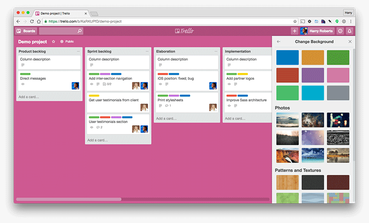
Theming—certainly for the purposes of this article—refers to the act of laying a veneer over the top of an already styled website: an optional extra which alters or customises the UI. A great example would be Trello’s style switcher: a user always sees the same structural web page, but they have the optional ability to colour it in differently—a style that simply lays on top of the existing design and extends it.

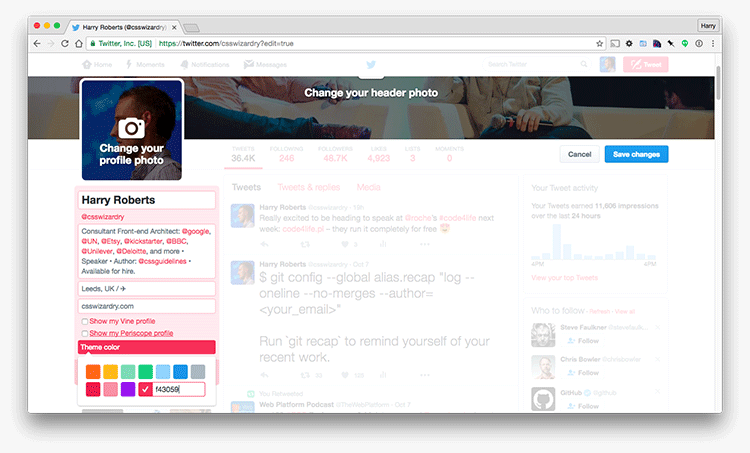
A slightly more specific subset of theming is user customisation. This is where the new veneer is supplied by the user, rather than coded up by developer (à la Trello). A great example of user customisation would be Twitter’s colour customisation

By using CSS’ custom properties and @supports, we can create a themeable UI
without having to compile multiple stylesheets, without having to generate new
CSS on the fly, and whilst also allowing users of non-supportive browsers to
have a completely usable website. We’ll be adopting a healthy dose of
pragmatism—we’re gonna be writing some CSS in our HTML—and progressive
enhancement—older browsers will not have access to any theme at all—to solve the
theming problem in a nicer and simpler way than perhaps we’re used to.
CSS variables, more correctly known as custom properties, are…
a family of custom author-defined properties known collectively as custom properties, which allow an author to assign arbitrary values to a property with an author-chosen name, and the
var()function, which allow [sic] an author to then use those values in other properties elsewhere in the document.
We’ve had variables in preprocessors for quite some time, but they have their own drawbacks. For one, they compile down to static CSS, so they don’t ever exist at runtime, inside of the browser. This means that the only way we can change our CSS through updating the value of variables is in our source code, which then needs recompiling. The practical upshot of this, as far as theming is concerned, is that we need to be aware of all of our possible themes at dev-time, and we need the ability to compile each one of them from our Sass. Even though we have variables, the resulting CSS is completely static.
CSS variables are interesting in that they do exist at runtime. This means that we can update their values in the browser and see the results immediately.
I could extol the virtues of CSS variables for hours, but you’d be far better
off watching Lea do the same thing in ten times
more detail and with infinitely more nuance: CSS Variables:
var(--subtitle);.
In order to understand this article, all you really need to know about custom properties is that they look like this:
:root {
  --var-name: value;
}
Let’s look at a few things:
:root {}: Custom properties must be defined within a scope. Because they
follow the same syntax as a regular declaration (i.e. [property]: [value];),
they have to exist inside a ruleset (in other words, inside of some curly
braces). In order to make a variable available globally, we can just define it
in the :root {} ruleset; to make it available only in our nav, we could
define it within .c-nav {}. This is scoping.--var-name: Custom properties are distinguishable by their leading double
hyphen. The name of the property is defined by the developer, for example,
--brand-color, --grid-gutter, --baseline-grid.value: This, predictably, is the value of the custom property.We can now use those properties throughout our CSS like this:
.foo {
  color: var(--var-name);
}
We use the new var() function to tell the browser that it’s about to use the
value of a custom property. That means that the following CSS:
:root {
  --spacing-unit: 10px;
  --color-main: #BADA55;
}

.box {
  color: white;
  background-color: var(--color-main);
  padding: var(--spacing-unit);
}
Is akin to writing:
.box {
  color: white;
  background-color: #BADA55;
  padding: 10px;
}
Play with that demo on jsFiddle.
Now, because custom properties are made available to us at runtime, we can alter them on the fly, in the browser, and see updates immediately—we don’t need to recompile or redownload any CSS!
If you visit this slightly updated
demo, you’ll see a style
block in the markup that contains redefined values for our custom properties.
Try modifying the values (20px, #C0FFEE) to anything else, and then hit
Run. Notice how the box adopts the brand new styles? That’s because of
custom properties’ runtime availability.
So, to quickly recap: because custom properties are available at runtime, we can create new themes on the fly without having to go back into any of our CSS files. This is the basis for our theming: we’re going to pass new values to our custom properties in the browser.
style BlocksThe primary use case for being able to redefine custom property values in the browser is to help us with Twitter-style user customisation: that is to say, allowing users to choose their own colour values through some kind of UI.
The most practical and pragmatic way to do this is to just drop their chosen hex
value into a style block in the HTML, as we’ve done above. Of course, we could
be nice and neat and generate a new stylesheet, save their chosen value to that,
and keep all of our style information out of the markup, but that has a number
of downsides:
head.It is far more practical to simply drop that user input into a style block in
the head of the HTML document: no writing CSS files, no extra requests.
The var() function can be passed an optional fallback value that gets used in
the event that the custom property it is calling has not been defined. That
looks a little like this:
a {
  color: var(--user-color, red);
}
Because we haven’t defined --user-color anywhere, this link will now render
red: it’s dropped back to the fallback value we provided. See a small demo of
that in action.
In the interests of resilience, it can be a good idea to declare fallback values for any custom properties that may either not exist, or whose values might be invalid at runtime.
@supportsAs a second layer of safety around our progressive additions, we can add a fork
in our codebase by using @supports. A vastly under-utilised CSS feature,
@supports has been around since Firefox 22 and Chrome 28, and is (at the time
of writing) available in over 80% of browsers
worldwide.
@supports—also known as feature queries—is an at-rule that encloses a
series of rulesets that the browser will only attempt to apply if it knows it
supports the declaration passed into it, for example:
@supports (display: grid) {

  /**
   * Code in here will only be applied in browsers that support display: grid;!
   */

}
If a browser does not support the queried feature, it simply skips over the entire block, falling back to anything that was defined before it. Again, in the interests of saving time, please see Jen Simmons’ fantastic introduction to feature queries.
Now, because CSS by design will ignore any single declaration that it doesn’t understand, there is every chance we could provide fallbacks for browsers that don’t support custom properties as simply as this:
/**
 * 1. Applied in all browsers.
 * 2. Ignored by all browsers who don’t understand it.
 */

.btn {
  color: red; /* [1] */
  color: var(--user-color); /* [2] */
}
However, I’d argue that if we’re got a definite fork in our code (e.g. if you support x, do this, otherwise, do this) it is more complete, explicit, and proper, to hide the relevant bits of new CSS behind a feature query. Rather than making use of the (admittedly specced) behaviour of error handling, let’s be a bit more formal.
What we have now is:
If you head back to the
demo, you’ll
notice that there’s a lot of repetition in the CSS source: running the exact
same feature query over and over, defining the same var() fallback value over
and over, defining the same fallback declaration over and over. We could (and
indeed should) use a preprocessor alongside our pure CSS to DRY this out, but
I purposefully avoided introducing Sass into this particular demo because to do
so would have only served to obscure the point I was trying to make.
If you wish to implement something like this, please feel free to introduce the preprocessor layer yourself—it is outside of the scope of this article, which exists to prove a concept, and not to be a production-ready solution. Optimise for your use case and make changes and improvements as necessary.
Theming, the vast majority of the time, is a complete nice-to-have. It is not business critical or usually even important. If you are asked to provide such theming, do not do so at the expense of performance or code quality.
Embrace newer features in order to introduce theming and customisation with little overhead, and a healthy dose of progressive pragmatism.
N.B. All code can now be licensed under the permissive MIT license. Read more about licensing CSS Wizardry code samples…
Harry Roberts is an independent consultant web performance engineer. He helps companies of all shapes and sizes find and fix site speed issues.

Hi there, I’m Harry Roberts. I am an award-winning Consultant Web Performance Engineer, designer, developer, writer, and speaker from the UK. I write, Tweet, speak, and share code about measuring and improving site-speed. You should hire me.
You can now find me on Mastodon.


I help teams achieve class-leading web performance, providing consultancy, guidance, and hands-on expertise.
I specialise in tackling complex, large-scale projects where speed, scalability, and reliability are critical to success.