By Harry Roberts
Harry Roberts is an independent consultant web performance engineer. He helps companies of all shapes and sizes find and fix site speed issues.
Written by Harry Roberts on CSS Wizardry.
o-c-u-t-s-is-/has-_js-qa-When we work at scale, we often find that we spend a large amount of our time reading, maintaining, and refactoring existing code, rather than writing and adding new features. This is the reason we focus so much on things like architectures, naming conventions, methodologies, preprocessors, scalability, etc.: because writing CSS is easy; looking after it is not.
What we want is to be able to write code that is as transparent and self-documenting as possible. Transparency means that it is clear and obvious (to others) in its intent; self-documenting means that we don’t have to lose time to writing and reading lengthy, supplementary documentation.
The need for this is particularly true when working with languages like HTML and CSS. Their declarative nature means there is no control flow to give clues as to the state or shape of the project, and the fact that the two languages are written separately but exist so closely often provides a large disconnect between some CSS’ source and where it is implemented. That is to say, we may see classes all throughout our markup, but that is only one very small part of the picture: somewhere else there is the corresponding CSS that completes the other half of the story. Cross-referencing these classes to ensure their proper treatment (reusing them elsewhere in the DOM, binding onto them to make modifications, deleting them to remove styling, etc.) requires a very diligent developer, and consumes a lot of time.
How many times have you looked at a piece of HTML only to wonder which classes do what, which classes are related to each other (if at all), which classes are optional, which classes are recyclable, which classes can you delete, and so on? A lot of times, I’m willing to bet.
Naming conventions like BEM do a fantastic job to help communicate the roles and responsibilities of the classes we find in our HTML, and if you’re not yet using BEM then I urge you to stop reading this article right now and to start with that instead—this post will be levelling BEM up a notch.
To quickly recap, BEM gives us two very useful suffixes—__element and
--modifier—that we append onto our classes in order to tell us the role of
certain bits of UI, for example:
/**
 * The top-level ‘Block’ of a component.
 */
.modal {}

  /**
   * An ‘Element’ that is a part of the larger Block.
   */
  .modal__title {}

/**
 * A ‘Modifier’ of the Block.
 */
.modal--large {}
In our CSS, this naming isn’t all that useful, but when we see it in out HTML we get a much better view of what’s going on:
<div class="modal  modal--large">

  <h1 class="modal__title">Sign into your account</h1>

  <div class="modal__content">
    <form class="form-login">
    </form>
  </div>

</div>
We can see from this that we have a number of classes all relating to our
.modal, and a class of .form-login which begins a brand new context.
Being able to glean this level of information from our classes in our markup
actually tells us quite a lot about the corresponding CSS, and also about how
and why they interact with each other in the way they do. It also tells us about
how we should (or should not) reuse these classes elsewhere in the DOM:
.modal--large, .modal__title, and .modal__content all have a dependency on
.modal, and therefore cannot be used without that .modal class also being
present.
This gives us some great transparency and—because it exists right there in our classes—it is also fairly self-documenting.
This is a naming convention. One thing I’ve been researching and implementing a lot with my clients lately is the idea of taking naming conventions a step further by adding namespaces.
A naming convention tells us how classes within a component relate to one another, but a namespace will tell us exactly how classes behave in a more global sense. A namespace tells us exactly what a class (or suite of classes) does in non-relative terms.
There are a number of common problems when working with CSS at scale, but the major two that namespacing aims to solve are clarity and confidence:
Usually, unfortunately, the answer to most of these questions is no. This is the main reason we end up with bloated codebases, full of legacy and unknown CSS that we daren’t touch. We lack the confidence to be able to work with and modify existing styles because we fear the consequences of CSS’ globally operating and leaky nature. Almost all problems with CSS at scale boil down to confidence (or lack thereof): People don’t know what things do any more. People daren’t make changes because they don’t know how far reaching the effects will be. Old CSS never gets deleted because it’s hard to tell where things might be being used.
As a result, we pile on new CSS, using new selectors, in order to avoid having to touch anything that exists already. Our CSS gets increasingly hard to manage, new styles get added where they might not be needed, legacy CSS remains a part of the core codebase, and then the only option is to do a complete teardown and rewrite every few years. Expensive.
With the nature of maintaining a large project like this, we often find that we spend more time reading markup and its styling through developer tools than we might do reading source CSS files. This means that meaningful class names become invaluable for communicating rich information to other developers.
We need to say exactly what a class does, why it exists, where (else) it might already occur, whether or not we can reuse it elsewhere, and how safe it is to bind onto or modify. This means that the names of the classes become documentation, and we can read all of that documentation right there in the view. Wouldn’t it be nice to know the exact scope and reach of a selector from its name alone? Read on…
In no particular order, here are the individual namespaces and a brief description. We’ll look at each in more detail in a moment, but the following list should acquaint you with the kinds of thing we’re hoping to achieve.
o-: Signify that something is an Object, and that it may be used in any
number of unrelated contexts to the one you can currently see it in. Making
modifications to these types of class could potentially have knock-on effects
in a lot of other unrelated places. Tread carefully.c-: Signify that something is a Component. This is a concrete,
implementation-specific piece of UI. All of the changes you make to its styles
should be detectable in the context you’re currently looking at. Modifying
these styles should be safe and have no side effects.u-: Signify that this class is a Utility class. It has a very specific role
(often providing only one declaration) and should not be bound onto or
changed. It can be reused and is not tied to any specific piece of UI. You
will probably recognise this namespace from libraries and methodologies like
SUIT.t-: Signify that a class is responsible for adding a Theme to a view. It
lets us know that UI Components’ current cosmetic appearance may be due to the
presence of a theme.s-: Signify that a class creates a new styling context or Scope.
Similar to a Theme, but not necessarily cosmetic, these should be used
sparingly—they can be open to abuse and lead to poor CSS if not used wisely.is-, has-: Signify that the piece of UI in question is currently styled a
certain way because of a state or condition. This stateful namespace is
gorgeous, and comes from SMACSS. It tells us that the
DOM currently has a temporary, optional, or short-lived style applied to it
due to a certain state being invoked._: Signify that this class is the worst of the worst—a hack! Sometimes,
although incredibly rarely, we need to add a class in our markup in order to
force something to work. If we do this, we need to let others know that this
class is less than ideal, and hopefully temporary (i.e. do not bind onto this).
js-: Signify that this piece of the DOM has some behaviour acting upon it,
and that JavaScript binds onto it to provide that behaviour. If you’re not
a developer working with JavaScript, leave these well alone.qa-: Signify that a QA or Test Engineering team is running an automated UI
test which needs to find or bind onto these parts of the DOM. Like the
JavaScript namespace, this basically just reserves hooks in the DOM for
non-CSS purposes.Even from this short list alone, we can see just how much more information we can communicate to developers simply by placing a character or two at the front of our existing classes.
It is probably worth noting at this point that these namespaces do not exist for encapsulation and sandboxing of styles, but for clarity and informative reasons. Ben Frain’s FUN convention utilises namespacing as a means of soft encapsulation.
o-Format:
.o-object-name[<element>|<modifier>] {}
Example:
.o-layout {}

  .o-layout__item {}

.o-layout--fixed {}
The o- namespace for Objects is a very useful one for any teams who use
Object-Oriented CSS.
OOCSS is fantastic in that it teaches us to abstract out the repetitive, shared, and purely structural aspects of a UI into reusable objects. This means that things like layout, wrappers and containers, the Media Object, etc. can all exist as non-cosmetic styles that handle the skeletal aspect of a lot of UI components, without ever actually looking like designed ‘things’.
This leads to much DRYer and drastically smaller stylesheets, but does bring with it one problem: how do we know which classes might be purely structural, and therefore possibly being used in an open-ended number of instances?
This poses problems on projects quite frequently. Picture the following example.
Imagine you’re a developer new to a project, and you have no intimate knowledge of the CSS or what its classes mean or do. You’re asked by a Product Owner to add some padding around the testimonials that appear on the site. You right click, Inspect Element, and you see this:
<blockquote class="media  testimonial">
</blockquote>
Now, it should be fairly clear here that what you should do is go and find the
.testimonial {} ruleset in your CSS and add the padding there. However, using
DevTools, you find that adding the padding to the .media {} ruleset has
exactly the outcome you expected. Perfect! Let’s go and add that into the source
CSS file.
The issue here is that .media is an abstraction (it’s actually the poster
child of Nicole Sullivan’s OOCSS) which, by definition, is a reusable and
non-cosmetic design pattern that can underpin any number of different UI
components. Sure, altering the padding of it in this instance gave us the
desired results, but it also may have just unintentionally broken 20 other
pieces of UI elsewhere.
Because objects don’t belong to any one specific component, and can underpin several vastly different components, it is incredibly risky to ever modify one. This is why we should introduce a namespace, to let other developers know that this class forms an abstraction and that any changes here will be reflected in every object sitewide. The object itself does not necessarily have anything to do with the implementation-specific bit of the UI that you are trying to change.
By adding a leading o- to the classes for our objects, we can tell other
developers about their universal nature, and hopefully avoid ever having people
binding onto them and breaking things. If you ever see a class that begins with
o-, alarm bells should ring and you should know to stay well away from it.
<blockquote class="o-media  testimonial">
</blockquote>
o-.c-Format:
.c-component-name[<element>|<modifier>] {}
Example:
.c-modal {}

  .c-modal__title {}

.c-modal--gallery {}
Components are some of the safest types of selectors we will encounter.
Components are finite, discrete, implementation-specific parts of our UI that
most people (users, designers, developers, the business) would be able to
identify: This is a button
; This is the date picker
; etc.
Usually when we make changes to a Component’s ruleset, we will immediately see
those changes happening every- (and only) where we’d expect. Unlike with
Objects, changing the padding on the .c-modal__content should not affect
anything else in the site other than the content area of our modal. Where
Objects are implementation-agnostic, Components are implementation-specific.
If we revisit the previous example, and introduce the Object and Components’ namespaces, we’d be left with this:
<blockquote class="o-media  c-testimonial">
</blockquote>
Now I can tell purely from this HTML that any changes I make to the .o-media
class may be felt throughout the entire site, but any changes I make to the
.c-testimonial ruleset will only modify testimonials, and nothing else.
c- is a specific thing.u-Format:
.u-utility-name {}
Example:
.u-clearfix {}
You will most likely be familiar with the Utility notation because of
SUIT. Utilities are complete single
responsibility
rules which have a very specific and targeted task. It is also quite common for
these rules’ declarations to carry !important so as to guarantee they beat
other less specific ones. They do one thing in a very heavy-handed and inelegant
way. They are to be used as a last resort when no other CSS hooks are available,
or to tackle completely unique circumstances, e.g. using .u-text-center to
centrally align one piece of text once and once only. They are only one step
away from inline styles, so should be used sparingly.
Because of their heavy-handed approach, their global reusability, and their exceptional use-case, it is incredibly important that we signal Utilities to other developers. We do not want anyone trying to bind onto these in future selectors. Take the following example, which actually happened on a project I worked on. A number of months into a project, a developer wrote this bit of CSS:
.footer .text-center {
  font-size: 75%;
}
Here we can see a problem: the .text-center class now has two responsibilities
when it appears anywhere inside .footer. It now has side effects, which are
something that Utilities should never, ever have.
By using a namespace, we can introduce a simple and unbreakable rule: if it
begins with u-, never reassign to it.
Utilities should be defined once, and never need changing.
Another problem that the Utility namespace solves is that it actually lets people know that there is a heavyweight rule being applied to the section of the DOM. It will help explain why certain things might be happening and hard to override. Take this example:
<div class="font-size-large">
  ...

  <blockquote class="pullquote">
  </blockquote>

  ...
</div>
A developer inheriting this might be confused as to why the blockquote’s font
size is different to what they expected. This is because it’s inheriting the
font size from a .font-size-large class used a little further up the DOM tree.
By adding a little more clarity to our classes, we can more quickly identify any
potential offenders: Ah, here’s a Utility, that must be what’s causing
it.
(This is actually a fairly good example of why we should use Utilities
sparingly.)
<div class="u-font-size-large">
  ...

  <blockquote class="c-pullquote">
  </blockquote>

  ...
</div>
Please see this post’s sister article Immutable CSS for more detail on these kinds of rule.
u-.t-Format:
.t-theme-name {}
Example:
.t-light {}
When we work with Stateful
Themes
(that is to say, themes that we toggle on and off) we normally do so by adding a
class to the body element. Examples of this approach to theming include
style-switchers (a user can toggle between different themes) and sub-sections of
a site (all blog posts have one theme colour, all news pages have another theme
colour, etc.). We simply add a class high up the DOM which then invokes that
theme for that particular page.
A simple way to denote any theme-related classes is to simply prepend them with
t-. Seeing a t- class in your HTML should tell you that Ah, right, the
view probably looks the way it currently does because we have a theme
invoked.
Now, all of the namespaces we’ve looked at so far are mainly of use to us in our
markup, but Theme namespaces are helpful in both our HTML and our CSS. Seeing,
for example, .t-light in our markup tells us that the entire DOM has a current
state applied to it, which is important to know whilst debugging. Seeing that
class in our CSS also tells us a lot: it helps to sandbox and isolate any chunks
of theme-related CSS inside namespaced rulesets:
.c-btn {
  display: inline-block;
  padding: 1em;
  background-color: #333;
  color: #e4e4e4;

  .t-light & {
    background-color: #e4e4e4;
    color: #333;
  }

}
Here we can see that our buttons have a light grey text colour on top of a dark
grey background, but when we invoke the .t-light theme, those colours invert.
Here we are encapsulating the style information, which means that finding,
debugging, and modifying Theme rules becomes much simpler.
s-Format:
.s-scope-name {}
Example:
.s-cms-content {}
Scoped contexts in CSS solve a very specific and particular problem: please be entirely certain that you actually have this problem before employing Scopes, because they can be misused and end up leading to actively bad CSS.
Oftentimes it can be useful to set up a brand new styling context for a particular section of your UI. A perfect example of this is areas of user-generated content, where some long-form/prose HTML has come from a CMS. The styling of this kind of content usually differs from the more app-like UI around it. You may have a class-heavy UI architecture to provide complex pieces of design like navigations, buttons, modals, etc., and inside all of this you may have a simple blog post which is populated via a CMS where the user writes plain text and cannot add any classes or complexity.
For a really terse but effective example of Scoping styles, see David Bushell’s Scoping Typography CSS.
You might want to style this free-form text differently from the rest of the surrounding UI, so you might employ a scoping context. For example:
<nav class="c-nav-primary">
  ...
</nav>

<section class="s-cms-content">

  <h1>...</h1>

  <p>...</p>

  <p>...</p>

  <ul>
    ...
  </ul>

  <p>...</p>

</section>

<ul class="c-share-links">
  ...
</ul>

<a href="" class="c-btn  c-btn--primary">Next article...</a>
Everything inside the .s-cms-content is inaccessible: we can’t get at the DOM
to add any classes to the nodes inside of it, so we might begin styling via a
Scope. That might look something like this:
/**
 * Create a new styling context for any free-text CMS content (blog posts,
 * news pages, etc.).
 *
 * 1. Use a larger and more readable typeface for continuous prose.
 * 2. Force all headings to have the same appearance, regardless of their
 *    hierarchy.
 * 3. Make links inside long text more apparent.
 */
.s-cms-content {
  font: 16px/1.5 serif; /* [1] */

  h1, h2, h3, h4, h5, h6 {
    font: bold 100%/1.5 sans-serif; /* [2] */
  }

  a {
    text-decoration: underline; /* [3] */
  }

}
I cannot stress the word might enough here. Nesting selectors is
bad: it leads to location-based styling,
meaning that styles are now tightly coupled to DOM structure; it prevents people
from being able to opt into styles, because nested selectors are very
dictatorial (i.e. this will happen if you put that in there
); having
a type selector as a Key Selector creates very greedy selectors, which can match
more of the DOM than you intend; and our specificity gets increased, meaning our
Scope will override previously defined styles, and in turn the Scope itself
becomes harder to override.
There’s a really good example we can grab from the Sass above. When compiled,
that code will give us this selector: .s-cms-content a {}. This selector is
in charge of adding underlines to links, and is also of a higher specificity
than a selector like .c-btn {}. This means that if we were to put a button
inside of this Scope, it would get an underline—this is something we probably
don’t want. This simple example outlines the potential for problems when working
with Scopes, so tread carefully.
Please make triple sure that that you need to employ a Scope before you start writing lots of nested selectors. If you are unsure, it may be best to err on the side of caution and leave Scopes out entirely.
Warnings aside, the actual s- namespace becomes incredibly useful for
signalling to developers that an entire area of the DOM is subject to one big
caveat. Anything we see styled in here might have an extra layer of styling
applied to it in a pretty opinionated and greedy manner.
is-/has-Format:
.[is|has]-state {}
Example:
.is-open {}

.has-dropdown {}
Stateful namespaces are lovely. They come from SMACSS, and they tell us about short-lived or temporary states of the UI that need styling accordingly.
When looking at a piece of interactive UI (e.g. a modal overlay) through
developer tools, we’ll probably spend some time toggling things on and off.
Being able to see classes like .is-open appear and disappear in the DOM is a
highly readable and very obvious way of learning about state:
<div class="c-modal  is-open">
  ...
</div>
It’s also incredibly handy in our CSS to tell people possible states that a piece of UI can exist in, for example:
.c-modal {
  ...

  &.is-open { ... }

}


  .c-modal__content {
    ...

    &.is-loading { ... }

  }
These classes work by chaining other classes, for example .c-modal.is-open.
This heightened specificity ensures that the State always takes prominence over
the default styling. It also means that we would never see a bare Stateful class
on its own in a stylesheet: it must always be chained to something.
The way in which States are different to BEM’s Modifiers is that States are
temporary. States (can) change from one moment to the next, perhaps based on
user action (e.g. .is-expanded) or from changes that are being pushed from a
server (e.g. .is-updating).
_Format:
._<namespace>hack-name {}
Example:
._c-footer-mobile {}
In certain and usually quite rare circumstances, we might need to add a class to our markup purely in order to help us hack or override something. If we ever do that, we need to signal that this class is hacky, it’s (hopefully) quite temporary, we want to get rid of it at some point, therefore do not bind onto, reuse or otherwise interface with it.
The reason for the leading underscore is simply to mirror the paradigm of private variables in programming languages. Variables that are private to the program should not be relied upon or reused by other developers, and that’s the same with our Hack classes.
These types of class are pretty easy to spot in our codebase, so any hacks will become very apparent, which is a good thing.
@media screen and (max-width: 30em) {

  /**
   * We need to force the footer to be a fixed height on smaller screens.
   */
  ._c-footer-mobile {
    height: 80px;
  }

}
js-Format:
.js-component-name {}
Example:
.js-modal {}
JavaScript namespaces are pretty common now, and most people tend to use them. The idea is that—in order to properly separate our concerns—we should never have styling and behaviour bound to the same hooks. To bind both technologies onto the same hook means we can’t have one without the other: our UI becomes all-or-nothing, which makes it very opinionated and inflexible.
When I worked at Sky, we had an incident where a developer had built a text-callout UI component that had a distinct appearance, and some behaviour to fade text in and out of it. A Product Owner asked that we reuse the same piece of UI elsewhere, but we didn’t need to fade multiple pieces of text in and out; it was just going to say the same thing all the time. Because the component had been built with JS and CSS binding onto the same hook, it meant that I couldn’t have a configuration of the component with its look and feel but without its behaviour. It took a chunk of refactoring to fix, and it could have been avoided simply by binding onto separate hooks.
It also means that we can work a lot more safely. It means that CSS developers can work and refactor freely without the worry that they will break some JS, and vice versa. It separates our concerns and leaves each team with its own hooks for its own purposes.
It’s probably also worth noting that because the JS namespace has nothing at all
to do with CSS, its format should be determined by your JS engineers. If your
JS team’s naming convention for variables etc. is camel case, then they should
be allowed to choose JS hooks like .jsModal if they so desire.
qa-Format:
.qa-node-name {}
Example:
.qa-error-login {}
An unusual, but potentially very useful namespace is this one, for your QA team. When running automated UI tests with something like Selenium, or a headless browser, it is quite common to do something like:
site.dev/loginI’ve had problems before where the authors of these automated UI tests were
binding onto CSS classes: e.g. Does
The problem with these tests looking out for style hooks is that simply
refactoring your CSS to use a different name can cause a test to fail, even if
the functionality is exactly the same. In a similar vein to our JS hooks,
automated UI tests should not be reliant on CSS classes. To do so breaks our
separation of concerns..message--error appear in the DOM?
What we need to do is have the QA team bind onto a suite of their own classes that we leave well alone. This means that if we start out with this:
<strong class="message error qa-error-login">
…and we refactor those nasty .message and .error classes, we should be left
with something like this:
<strong class="c-message c-message--error qa-error-login">
We can make all of the CSS changes we like, as long we we ensure that the QA team’s hook stays in place.
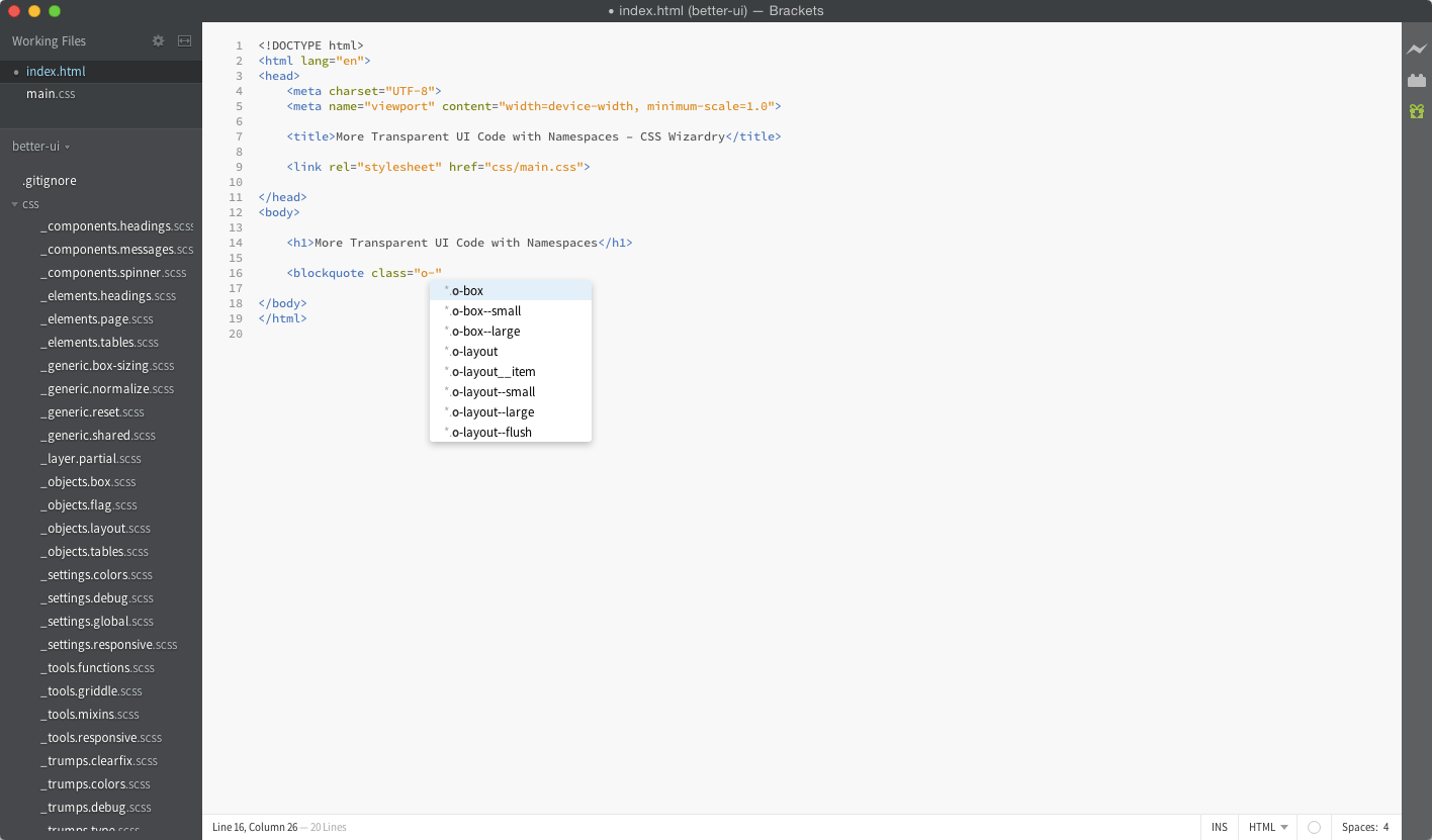
One amazing, incredibly useful, completely accidental, free-of-charge side effect of adding these namespaces comes when we use a text editor with class autocompletion:
Simply by hitting o- we get presented with a list of every single Object in
our project; by hitting c- we get shown every usable Component; u- gives us
Utilities, and so on.
This is a really, really nice feature: a find-as-you-type of every different type of class in the codebase. It makes things easily findable for those who know what they’re looking for, and makes things easily discoverable for those who just want to find out what Components might be available to them.
Because our classes now have this really, really strict naming, we can quite easily find
I wrote a pretty crude regex to find valid classes:
^\.(_)?[a-z]+-[a-z0-9-]+((_{2}|-{2})?[a-z0-9-]+)?(-{2}[a-z0-9-]+)?[a-z0-9]$
This will match all of the following:
.o-layout__item
.c-modal--wide
.u-text-center
.c-nav-primary__link--home
._c-footer-mobile
But none of these:
.foo // No namespace
.c-datePicker // Camel case
.o-media_img // Single underscore
.c-page-head-- // Trailing punctuation
This works by:
^: Make sure we are at the very beginning of the string.\.: Must start with a period (i.e. is a class).(_)?: Optional leading underscore (i.e. a Hack).[a-z]+: A single alpha, lowercase string of one letter or more (i.e. a
namespace).-: A single hyphen separator.[a-z0-9-]+: Alphanumeric, lowercase, hyphen delimited string of one or more
characters (i.e. Block name).(: Open an optional match.
(_{2}|-{2})?: Optional two underscores or hyphens (i.e. an Element or a
Modifier).[a-z0-9-]+: Alphanumeric, lowercase, hyphen delimited string of one or more
characters (i.e. Element or Modifier name).)?: Close the optional match.(-{2}[a-z0-9-]+)?: Optional alphanumeric, lowercase Modifier on the end of
all of that.[a-z0-9]: Ensure that the very last character is alphanumeric (i.e. no
trailing punctuation).$: Make sure we reach the very end of the string.Yes, that’s very icky. I’ve never really written any regex before, so I have absolutely no doubt at all that there is a much more terse and effective way to achieve the same thing, but for now this regex seems to work for (almost) all eventualities: try it out.
If you’d like to visualise the amount of, say, Components that are currently in any given view, you simply need a bit of CSS like this:
[class^="c-"],
[class*=" c-"] {
  outline: 5px solid cyan;
}
This works by:
[class^="c-"]: Find all class attributes that start with the string c-,
e.g.:
<blockquote class="c-testimonial">
[class*=" c-"]: Find all class attributes that contain the string <space>c-,
e.g.:
<blockquote class="o-media c-testimonial">
A more complete example:
[class^="o-"],
[class*=" o-"] {
  outline: 5px solid orange;
}

[class^="c-"],
[class*=" c-"] {
  outline: 5px solid cyan;
}

[class^="u-"],
[class*=" u-"] {
  outline: 5px solid violet;
}

[class^="_"],
[class*=" _"] {
  outline: 5px solid red;
}
What this allows us to do is get a quick visual indication of the rough make-up of a page. Lots of red? Yikes! That means there are a lot of hacks. Lots of violet? That implies you’re using a lot of utilities: could you maybe refactor and tidy them up?
It’s not bulletproof or failsafe, but it’s a really handy start in getting a high-level overview of the composition of your UIs.
If we want to find all types of namespace in our CSS files, we simply need to run a Grep, like so:
$ git grep "\.t-"
This will yield all Theme namespaces (the \ is simply escaping the . so that
it matches the . string, and not its regex meaning of anything) in our
source CSS files.
Naturally, swapping out the t- for c- would return all of our Component
namespaces.
If you’re not too keen on the idea of typing out o- and c- for every
class—and particularly if you aren’t really interested in the autocomplete
benefits we can gain—another format we could employ is .object, .Component.
That is to say, naming any widespread Object classes with no namespace and a
lowercase first letter, and naming our Component classes with no namespace and
a capitalised first letter.
This actually feels almost natural: because components are named, complete pieces of UI, it feels proper to give them title case. Take these examples:
<blockquote class="media  Testimonial">
</blockquote>

<ul class="list-inline  Nav-Primary">
</ul>

<ul class="box  box--large  Panel  Panel--info">
</ul>
Lowercase is a generic and global abstraction, title case is a named piece of specific UI.
This would lose some other features we gained (namely autocompletion, regexing, and highlighting these pieces of UI visually) but will save you some keystrokes. The decision is yours.
Because each namespace tends to be the first letter of the type of class, we
should find that learning the namespaces is actually very simple: c- means
Component, t- means Theme, o- means Object. However, that isn’t to say we
shouldn’t document our namespaces formally somewhere.
The beauty of namespaces like these is that they’re completely rule based. There’s no room for interpretation, which means two things:
I would recommend creating a simple cheat sheet of your namespaces, printing it out on A3 paper, and hanging on the wall in front of your engineers. These rules are so straightforward that they can quite easily be distilled down and presented as a simple cheat sheet guide that anyone can follow.
For reference, here’s a particularly useful cheat sheet I referred to when I began to learn Vim.
Below is a very contrived and forced example to try and demonstrate the power of meaningful namespacing. Of course, this example suffers two key problems:
So, what can we learn from this:
<body class="t-light">

  <article class="c-modal  c-modal--wide  js-modal  is-open">

    <div class="c-modal__content">

      <div class="s-cms-content">
        ...
      </div>

    </div><!-- /.c-modal__content -->

    <div class="c-modal__foot">

      <p class="o-layout">
        <span class="o-layout__item  u-1/3">
          <a href="" class="c-btn  c-btn--negative  qa-modal-dismiss">Cancel</a>
        </span>

        <span class="u-hidden">or</span>

        <span class="o-layout__item  u-2/3">
          <a href="" class="c-btn  c-btn--positive  qa-modal-accept">Confirm</a>
        </span>
      </p>

    </div><!-- /.c-modal__foot -->

  </article><!-- /.c-modal -->

  <footer class="c-page-foot">
    <small class="c-copyright  _c-copyright">...</small>
  </footer>

</body>
</html>
Well, we can learn a lot:
.t-light): The UI probably has its
current look and feel because of that..c-modal) which is using a wide variant
(.c-modal--wide). It has some JS binding onto it (.js-modal) and it is
currently open (.is-open)..c-modal__content and
.c-modal__foot)..s-cms-content). This content comes from a place where we cannot get at the
DOM nodes individually, so we revert to styling everything from a new context..o-layout) which is currently laying out:.u-1/3, .u-2/3)..c-btn) which have:.qa-modal-dismiss,
.qa-modal-accept).All of that learned just from some rich meaning placed in front of our classes. Amazing.
Contrast that with the following:
<body class="light">

  <article class="modal  wide  open">

    <div class="modal__content">
      ...
    </div><!-- /.modal__content -->

    <div class="modal__foot">

      <p class="layout">
        <span class="layout__item  1/3">
          <a href="" class="btn  btn--negative">Cancel</a>
        </span>

        <span class="hidden">or</span>

        <span class="layout__item  2/3">
          <a href="" class="btn  btn--positive">Confirm</a>
        </span>
      </p>

    </div><!-- /.modal__foot -->

  </article><!-- /.modal -->

  <footer class="page-foot">
    <small class="copyright">...</small>
  </footer>

</body>
</html>
Other than the BEM naming, I can glean very little from this piece of HTML. I’m left in the dark, unaware of what I might be able to recycle, modify, or delete.
Okay, we’re at over 6,400 words now, let’s wrap this up.
BEM has already provided us with amazing clarity in our classes. Adding namespaces on top of this creates incredibly rich meaning that lives right there in our HTML. This level of clarity gives us much greater confidence when reworking existing markup, and helps us to make better and more informed decisions.
It also means fewer regressions and collisions when working in multidisciplinary teams (e.g. JS engineers, QA engineers, etc.).
We also get some pretty cool side effects if our text editor supports class autocompletion: a find-as-you-type directory of all of the different classifications of style in our project.
Self-documenting, transparent UI code through namespacing.
Harry Roberts is an independent consultant web performance engineer. He helps companies of all shapes and sizes find and fix site speed issues.

Hi there, I’m Harry Roberts. I am an award-winning Consultant Web Performance Engineer, designer, developer, writer, and speaker from the UK. I write, Tweet, speak, and share code about measuring and improving site-speed. You should hire me.
You can now find me on Mastodon.
 London Web Standards: London (England), November 2024
I am available for hire to consult, advise, and develop with passionate product teams across the globe.
I specialise in large, product-based projects where performance, scalability, and maintainability are paramount.