By Harry Roberts
Harry Roberts is an independent consultant web performance engineer. He helps companies of all shapes and sizes find and fix site speed issues.
Written by Harry Roberts on CSS Wizardry.
N.B. All code can now be licensed under the permissive MIT license. Read more about licensing CSS Wizardry code samples…
As we all (should) probably know by now, specificity is is one of CSS’ most troublesome features, and is an area that soon becomes hard to manage on projects of any reasonable size. Specificity is a trait best avoided, which is why we don’t use IDs in CSS, and we don’t nest selectors unless absolutely necessary.
However, we can’t avoid specificity completely: there are types of selector that we have to use on projects that are inherently more or less specific than others. For all we can avoid the worst bits, we need a way to manage the necessary parts. Enter The Specificity Graph.
The Specificity Graph is something I have only been speaking about recently, and is a cornerstone of my currently unpublished ITCSS architecture. It is a very simple model for diagrammatically assessing the overall health of your codebase in terms of specificity—a way of looking at an entire project’s CSS and highlighting any potentially troublesome areas of higher-than-ideal specificity. We can then use this snapshot to refactor and rearchitect old projects into a better shape, or to ensure we’re writing new projects in a sustainable manner.
It is worth highlighting explicitly and up front that the Specificity Graph is currently just a high-level and relatively crude model. Its aim is to give a very broad and general overview of the specificity of selectors across an entire project. It is not—yet, at least—an automated tool of any sort that will plot an accurate graph for you: it is a way of you assessing your own codebase and loosely plotting it yourself. One thing I would be keen to do is speak to Katie about putting the Specificity Graph into Parker one day (if she thinks it’s suitable, appropriate, and feasible).
The Specificity Graph works by taking a look at your entire project’s CSS, and plotting the specificity of all of its selectors on a simple line graph. On the x axis we plot Location in Stylesheet (whereabouts was the selector found? Line 10? Line 2663?) and on the y axis we plot the specificity of that selector (was it an ID? Was it a class? Was it a type selector?).
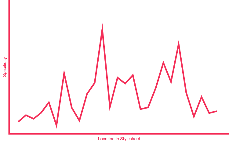
You can very roughly plot your own Specificity Graph by taking a look at your codebase at a very high level. It won’t be 100% accurate, but remember, this is just a model. You’ll likely find that, for most existing projects, you’ll get a graph that looks something like this:

As you can see, this is a very crude representation—we don’t even have any units on our axes!—but it instantly shows us the general distribution of specificity across this project. It’s erratic and poorly managed: these peaks and troughs are bad news. A peak represents a selector of a relatively high specificity, and occurs before a selector of a lower specificity. This is the specificity wars visualised: whenever you are in a valley, you have to climb back out to at least the height of the previous mountain if you want to overcome it.
Even this very basic model can tell us a lot about the current state of, and pitfalls with, the specificity in our project. We can visualise the places where we might expect problems, see why we have problems right now, and then we can use that information to refactor or rework our CSS into a better shape.
A graph with a lot of peaks and troughs is a bad Specificity Graph: it is telling us that our CSS is full of—or prone to—specificity issues because of weighty selectors being defined before lighter ones. We have a codebase that is likely to prove problematic because we have erratic and poorly managed specificity-and-source-order: we are more likely to spend time undoing or negating the effects of high specificity CSS that was defined too early in the project.
A spiky graph is a bad graph.
It’s all well and good knowing what our Specificity Graph currently looks like, but what should it look like? Well, if we know we want to avoid peaks and troughs, we could presume that we want a flat graph: a flat graph means no specificity wars because there are no valleys to leave or mountains to overcome.
The issue there is that it’s impossible to have a perfectly flat line because
there will always be some selectors that are of a lower or higher specificity
than others. You have type selectors (blockquote {}, a {}, table {},
etc.), class selectors (.btn {}, .carousel {}, .media {}, etc.), and
potentially even some !importants (on your helper and utility classes).
It should go without saying that we don’t have any IDs.
The key here isn’t so much eliminating specificity completely, but managing it better. In general we do want to keep specificity low at all costs, but any unavoidable specificity we introduce needs taking care of appropriately.
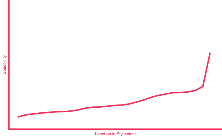
We don’t want a flat graph, we want an upward-trending one:

An upward trending Specificity Graph represents CSS that is, essentially,
written in specificity order. We start with low specificity selectors at the
beginning of the project (the * {} selector for global box sizing, for
example), followed up by type selectors (unclassed HTML elements, like ul {}),
followed up by class-based component selectors (such as .site-nav {}, or
.calendar {}) and finally ending with our overrides and helper classes (like
.clearfix {}, or .hidden {}).
As a specific example, a lot of people tend to include their helper classes
quite early on in a project, because they feel global and ‘frameworky’. The
issue here is that these often carry !important, making them very high
specificity. Including these types of rule early on in a project produces a huge
spike in the Specificity Graph right near the beginning, setting the bar very
high for subsequent work. Move all utility and helper classes to the very end of
your CSS in order to introduce a spike right at the end, meaning you’re far less
likely to have to undo or override high specificity selectors in your
subsequent work.
Any further CSS you add to the project should be authored in the relevant places in order to maintain the upward trending graph. No more bolting things on to the end of a stylesheet! If you’re adding new rules for type selectors, do not put them after your modules’ styles; if you’re adding new utilities, put them after everything else.
Ordering CSS based on its specificity leads to much simpler and hassle-free maintenance, as well as offering improved scalability due to more evenly distributed complexity and a more sane working environment.
Always try to maintain an upward trending Specificity Graph across your projects. It is a very helpful way of keeping a high-level view of your code, it is a very simple litmus test and benchmark, and also provides a really effective way of writing better quality CSS in more general terms.
It is important to re-stress the word trending. The Specificity Graph should trend upward. There will be little ups and downs along the way, for example:
.module {
}

    .module__header {
    }


.module--large {
}

    .module--large > .module__header {
    }
Here we would get a kink in our graph where the .module--large >
.module__header {} selector is double that of its neighbours. These kinks do,
unfortunately, get magnified when we run our code through an actual Specificity
Graph tool, which leads me to believe that the Specificity Graph is probably
best kept as a conceptual model.
The aim of the Specificity Graph is to illustrate the importance of not having
overly specific selectors appearing too early on. Close-ups of the graph will
show many jagged, saw-tooth sections, but my aim has always been to concentrate
on the overall trend of the whole graph. Saw-toothing is to be expected; what we
do not want is all of our helper classes, carrying !importants, to appear at
the beginning of our project.
Again, we need to look at the overall trend. The graph needs to trend upward, even taking into account the many ups-and-downs along the way.
N.B. All code can now be licensed under the permissive MIT license. Read more about licensing CSS Wizardry code samples…
Harry Roberts is an independent consultant web performance engineer. He helps companies of all shapes and sizes find and fix site speed issues.

Hi there, I’m Harry Roberts. I am an award-winning Consultant Web Performance Engineer, designer, developer, writer, and speaker from the UK. I write, Tweet, speak, and share code about measuring and improving site-speed. You should hire me.
You can now find me on Mastodon.


I help teams achieve class-leading web performance, providing consultancy, guidance, and hands-on expertise.
I specialise in tackling complex, large-scale projects where speed, scalability, and reliability are critical to success.