Next: How I helped the Financial Times with their CSS architecture.
CSS Wizardry: MVP Design and Development
Written by Harry Roberts on CSS Wizardry.
Table of Contents
It seems a little odd to list your own website as a case study on itself, but getting to be my own client proved pretty interesting, and having free reign of the techniques I employed with very few external constraints was definitely something of a novelty.
I worked in a very intense sprint to get an MVP together, which provided me with a more solid foundation to present CSS Wizardry as a business, rather than as just a blog.
The project
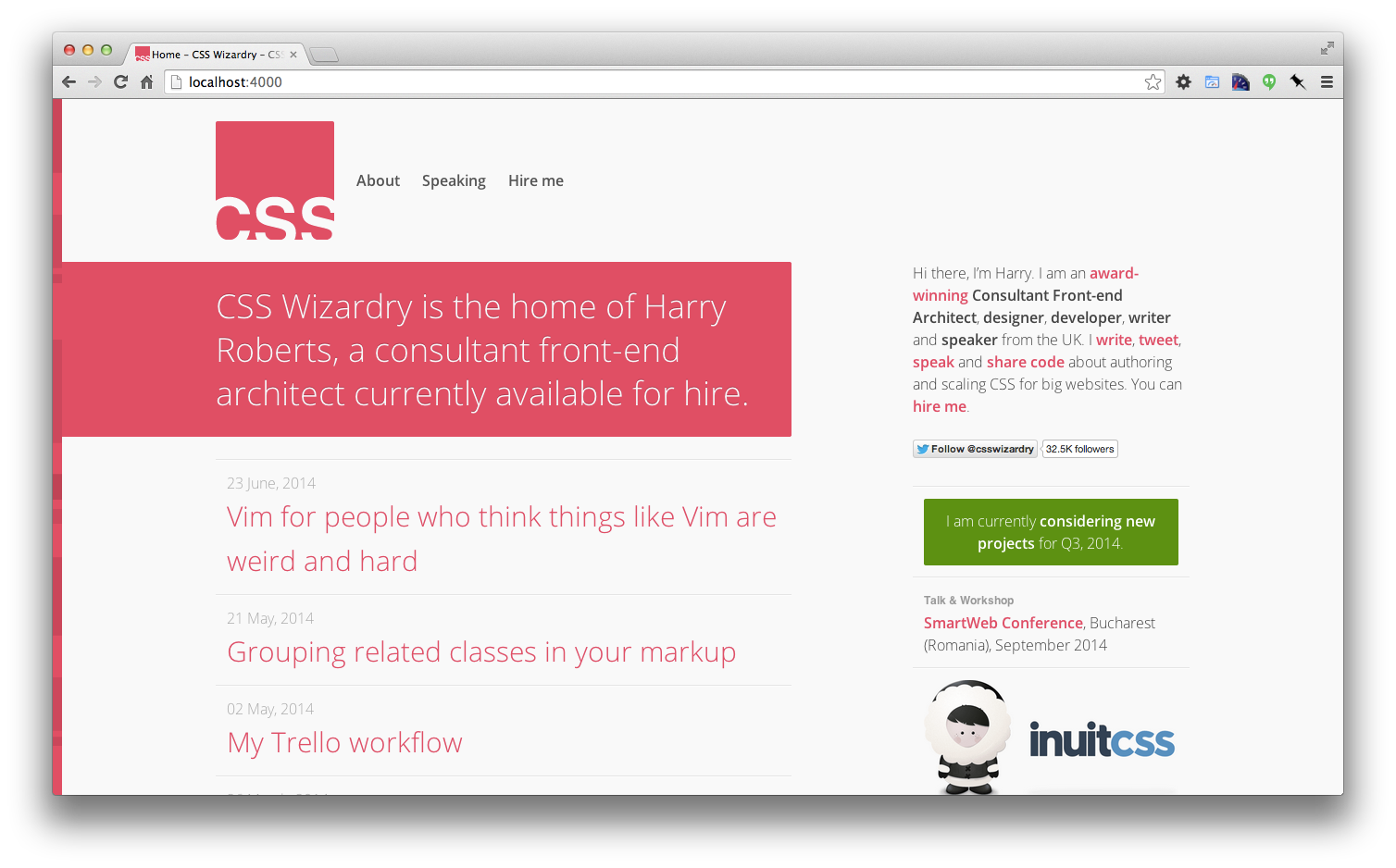
Since deciding to work for myself last year, I’d not managed to give CSS Wizardry the full redesign it deserved—it was still just a personal blog, which didn’t really give visitors the impression that I was in fact running a business. In a bid to circumvent this in the short term, I created a dedicated Work micro-site which I ran as its own product. This was to be my business face to the world for almost a year, and in that time it grew into a product in its own right. At the time of writing, that single page micro-site has over 180 commits against it!

Redesigning a site is never a quick task, particularly when it’s your own, which is largely the reason I opted for a separate micro-site instead of overhauling CSS Wizardry wholesale. This move meant I could get something live very quickly, but also brought with it some tech debt: I would be maintaining two separate codebases, and the task of redesigning the main website was just being postponed.
I decided, after enough putting it off, to tackle a redesign head-on over my birthday weekend. Not a lot of time, but enough to get a solid MVP together. The requirements for that MVP were simple:
- Maintain at least feature-parity with the current website.
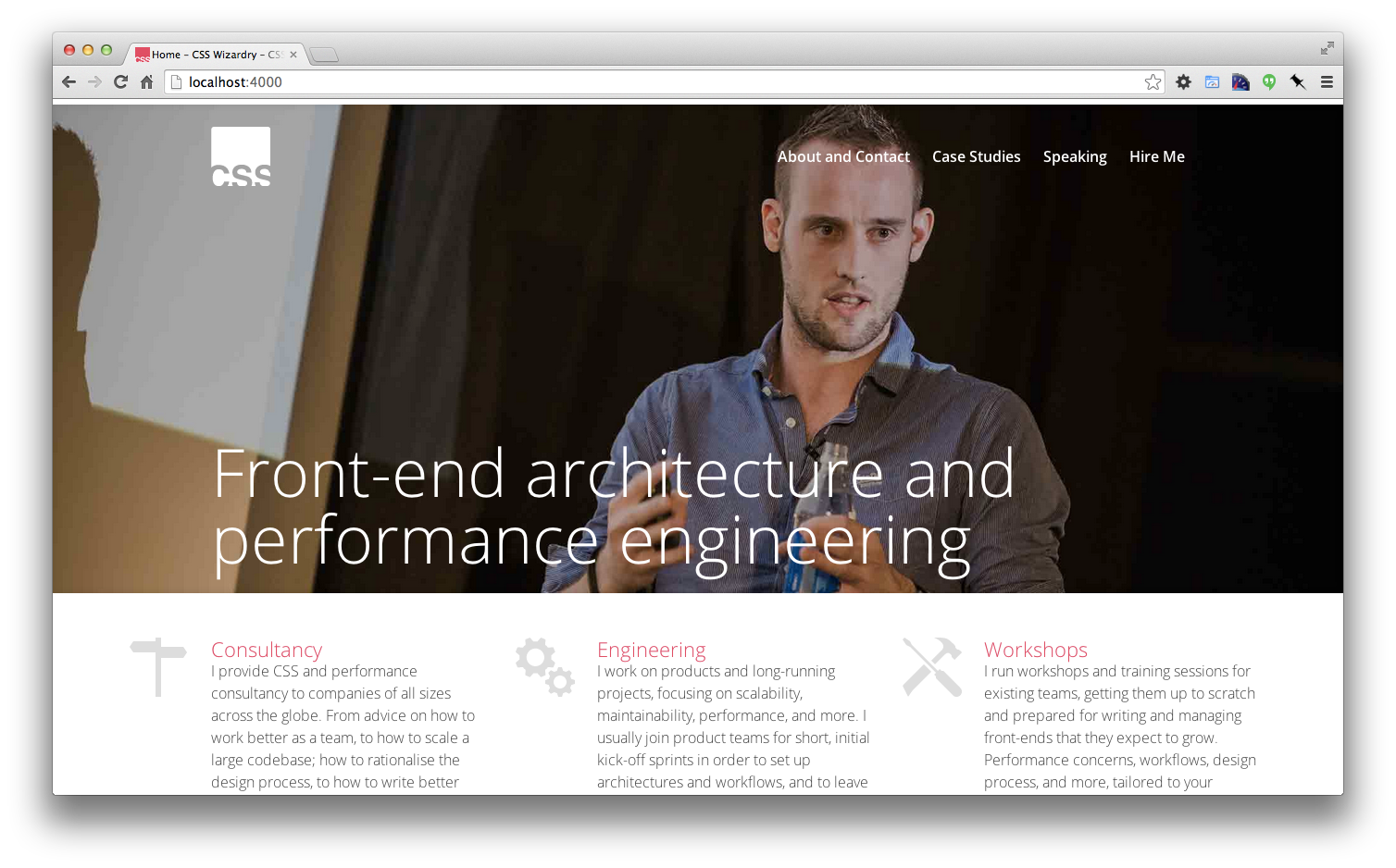
- Provide a more business-focussed homepage.
- Put less (but not too little) focus on blog posts.
- Introduce a Case Studies section to feature client work (given that the majority of my work is consultancy based, case studies make more sense than a portfolio does).
The process
As I’m not too great a designer, I didn’t want to spend ages frustrating myself making mockups in Sketch. I scribbled a rough wireframe onto a folded up piece of printer paper, and set my mind toward thinking about how I might want something to look and, more importantly, function. I installed a brand new instance of Jekyll, ported over my old content, and got hacking away straight into code.
I set up a Trello board to try and keep things focussed, but ultimately I just bounced around ideas and features as soon as I thought of them.
Having the content already there was a real boon, and meant that I didn’t have that much work to do restructuring any of the IA. I’d spent weeks on end constantly tweaking and refining the copy used throughout the site, so it was something I didn’t really need to worry about during the redesign.

The tech
Naturally, CSS Wizardry is built on top of inuitcss, my open-source, Sass-based, OOCSS framework. inuitcss is currently (at the time of writing) in a state of flux: its GitHub repos are a collection of pre-alpha modules that, although stable, are still, as yet, unofficial. Despite that, I know that I have complete faith in the new version of inuitcss—the NHSx site was built on the pre-alpha modules with great success.
Using inuitcss (installed via its Bower packages) meant that I had the UI’s framework and architecture set up in less than half-an-hour. This helped me work very quickly.
As well as using inuitcss, I built the CSS onto ITCSS, an as-yet unpublished, proprietary CSS architecture of mine which lends itself well to scalability and manageable code on long-running products, which CSS Wizardry certainly aims to be.
As mentioned, the site is built on Jekyll, which can be hosted on GitHub Pages, and its source code is hosted on GitHub.
The site is responsive—mobile-first flavour—and testing it (as well as demoing it to friends and peers) was made incredibly easy by using Finch, a new product which allows developers to securely expose their local dev sites to any internet-connected device. This meant I could check CSS Wizardry on mobiles, tablets, and larger screens without having to host it on a staging server. Being able to save time like this definitely helped me hit my self-imposed deadline.
Finally, due to no external requirements or constraints, this iteration of CSS Wizardry practices everything I preach. Further, it will continue to do so, as it is built on an architecture designed to accommodate change.
Summary
I gave myself a very tight deadline to get together an MVP for a better positioned, more business focussed CSS Wizardry. Working with open-source tools, and in a very pragmatic and agile manner, I was able to get the MVP live over the course of a long weekend.
I am now in a position where I can move CSS Wizardry forward as a product, and, after a very intense initial sprint, spend fragments of time improving and honing the site in coming weeks. It was very important to me that I get something ‘good’ live in a few days, rather than spending months trying to strive for ‘perfect’.

Hi there, I’m Harry Roberts. I am an award-winning Consultant Web Performance Engineer, designer, developer, writer, and speaker from the UK. I write, Tweet, speak, and share code about measuring and improving site-speed. You should hire me.
You can now find me on Mastodon.
Projects

- ITCSS – coming soon…

Next Appearance
-
Talk & Workshop
 WebExpo: Prague (Czech Republic), May 2024