Nesting Your BEM?
Written by Harry Roberts on CSS Wizardry.
Table of Contents
Let me please start this post by saying that this is not a recommendation or new ‘best practice’. This is me thinking out loud.
I’m a huge fan and proponent of BEM, and have been for many years. It’s kinda funny looking, sure, but it provides me with a lot of things:
- Soft encapsulation which helps to reduce naming collisions.
- Self-documenting CSS which helps me to learn about DOM nodes’ relationships with one another.
- Targetted selection which helps to reduce subtree collisions and capturing too much of the DOM.
- Managed specificity which is always a huge plus.
- Strict implementation rules which prevent me from using classes outside of a given context.
Except that last point is only half true…
BEM tells us that a class of, say, .widget__title, can only be used inside of
.widget. However, this is only by agreement. A developer could drop
.widget__title inside of .modal and things would still work. They might do
this because
- they haven’t seen BEM before, and don’t know about the usage it enforces, or;
- they’re being lazy and have spotted that—even though they shouldn’t—they can
reuse the
.widget__titlestyling inside of.modaland leave work five minutes early.
They could do this, and it would work out for them: things would still render correctly. They wouldn’t get any errors because BEM is just a convention, and conventions require agreement.
To circumvent this, we could write our CSS like this:
.widget { }

.widget .widget__title { }
Now the developer can’t use .widget__title inside of .modal, because we’ve
told our CSS that .widget__title only works if we put it inside of
.widget. Now we are beginning to enforce things, and this will prevent abuse.
There’s a problem though: nesting.
Nesting in CSS
For a very long time now, I have actively claimed that nesting in CSS is a bad thing, because it
- increases specificity (which should always be well managed);
- introduces location dependency (a hallmark of an inflexible system)
- reduces portability (meaning we can’t move things around if we need to);
- increases fragility (nesting means more chances for the selector to go wrong).
In short, keep your CSS selectors short.
But in the case of nesting BEM we see that nesting does in fact give us tangible benefits. How do we deal with the downsides?
Specificity
It is often noted that it is important to keep specificity low at all times. This is certainly true, and is very good advice, but, as ever, it is a little more nuanced than that. What people really mean when they say this is that specificity should be well managed at all times. That is to say, we should have consistency and very little difference between our selectors.
In theory (although please, dear lord, do not ever do this), a project whose only selectors are IDs would have well managed specificity: the specificity would be universally high, but would at least all be equal and consistent.
When we talk about well managed specificity, we’re talking about Specificity Graphs which are as flat as possible.
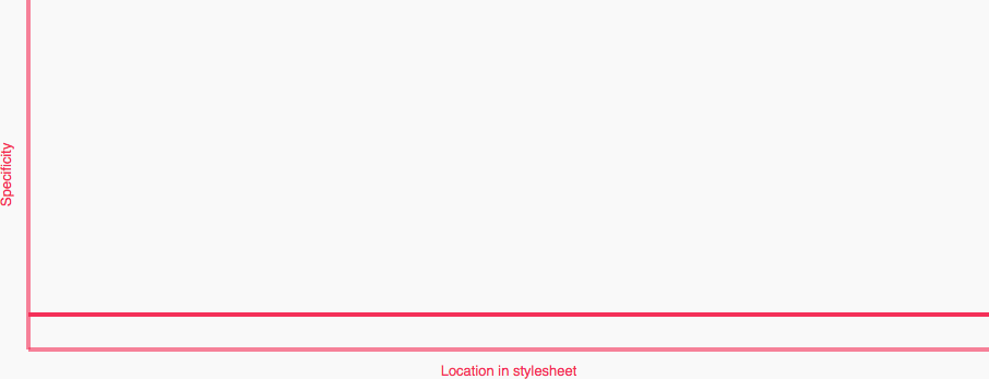
If we look at the following CSS for a series of components:
.nav-primary { }

  .nav-primary__item { }

    .nav-primary__link { }


.masthead { }

  .masthead__media { }

  .masthead__text { }

    .masthead__title { }


.sub-content { }

  .sub-content__title { }

  .sub-content__title--featured { }

  .sub-content__img { }
…we see that they all have the exact same specificity of one class each, which gives us a nice flat specificity graph:
As soon as we nest the Element classes, like so:
.nav-primary { }

  .nav-primary .nav-primary__item { }

    .nav-primary .nav-primary__link { }


.masthead { }

  .masthead .masthead__media { }

  .masthead .masthead__text { }

    .masthead .masthead__title { }


.sub-content { }

  .sub-content .sub-content__title { }

  .sub-content .sub-content__title--featured { }

  .sub-content .sub-content__img { }
…we see a Specificity Graph more like this:
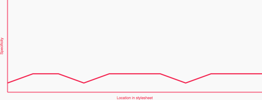
Uh oh! Spikes! Spikes are exactly what we want to avoid as they represent fluctuations between low and high specificity selectors within close proximity in the project.
Here we are visualising the specificity downside to nesting. Can we circumvent it? How?
Chain the First Class
If we were to chain the first class (the Block) with itself, like this:
.nav-primary.nav-primary { }

  .nav-primary .nav-primary__item { }

    .nav-primary .nav-primary__link { }


.masthead.masthead { }

  .masthead .masthead__media { }

  .masthead .masthead__text { }

    .masthead .masthead__title { }


.sub-content.sub-content { }

  .sub-content .sub-content__title { }

  .sub-content .sub-content__title--featured { }

  .sub-content .sub-content__img { }
…we can make its specificity match that of all of the nested Elements with zero side effects:
- We don’t need to know where the Block exists in the DOM, so we we’re not increasing its specificity based on a location that could change.
- We’re not chaining with another, different, or specific element or class, which means that the Block class is still very portable.
This specificity increase is completely self contained. Now we see a Specificity Graph that looks like this:
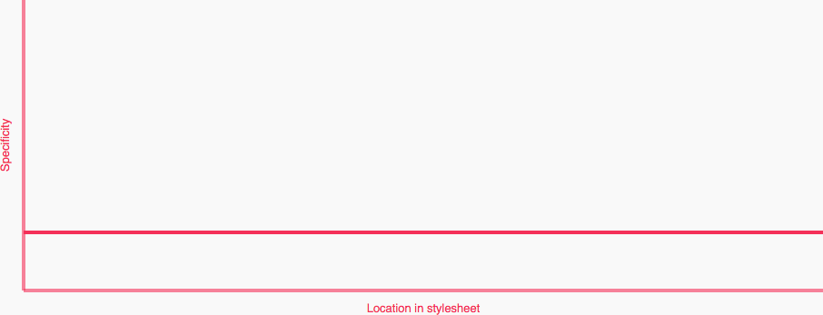
Higher than the first graph, but still perfectly flat. Although our specificity is now two classes high, it is still well managed: there are no specificity heavyweights across our components’ selectors.
Simplifying with Sass
To make this nesting and chaining much easier, we can lean on a preprocessor. In this case, Sass.
We should all be familiar with how nesting regular selectors in Sass looks:
.nav-primary {

  .nav-primary__item { }

  .nav-primary__link { }

}
Which gives us, as we’d expect:
.nav-primary { }

  .nav-primary .nav-primary__item { }

    .nav-primary .nav-primary__link { }
But how do we quickly and effectively chain the first class with itself? Like this:
.nav-primary {

  &#{&} { }

  .nav-primary__item { }

  .nav-primary__link { }

}
By using &#{&}, we can chain the parent class with itself. This means that all
our styles for the Block (in this case, .nav-primary) go here:
.nav-primary {

  &#{&} { /* Block styles */ }

}
See a small example on Sassmeister.
Practical Upshot
Now we are in a position where we are actually enforcing usage, and actively stopping selectors from working if we move them outside of the correct part of the DOM. This can help us working in environments where other developers do not understand how BEM works, or who are prone to just hacking things around until things look right.
We also have a managed (albeit increased) specificity across all of our classes.
Downsides
We’re increasing specificity, which is generally something we should always strive to avoid.
Use Cases
If you would like to try rolling out this technique, it would be worth
identifying some key use cases and starting from there. One that immediately
springs to mind is grid systems. Time and time again I see developers trying to
use .grid__item classes outside of the .grid parent, so if I were to start
using this technique I would probably start there:
.grid.grid {  }

  .grid .grid__item {  }
To Use or Not to Use?
I’m not sure. Like I said at the beginning, this is not a technique I am actively recommending or promoting. I just want to put it out there as an option, particularly for developers who find them in an environment where other developers are prone to abusing CSS.
However, I will say this: if you are already nesting your BEM then go back and level out your Specificity Graph by chaining your first class.

Hi there, I’m Harry Roberts. I am an award-winning Consultant Web Performance Engineer, designer, developer, writer, and speaker from the UK. I write, Tweet, speak, and share code about measuring and improving site-speed. You should hire me.
You can now find me on Mastodon.
Projects

- ITCSS – coming soon…

Next Appearance
-
Talk & Workshop
 WebExpo: Prague (Czech Republic), May 2024